


.svg)

.png)
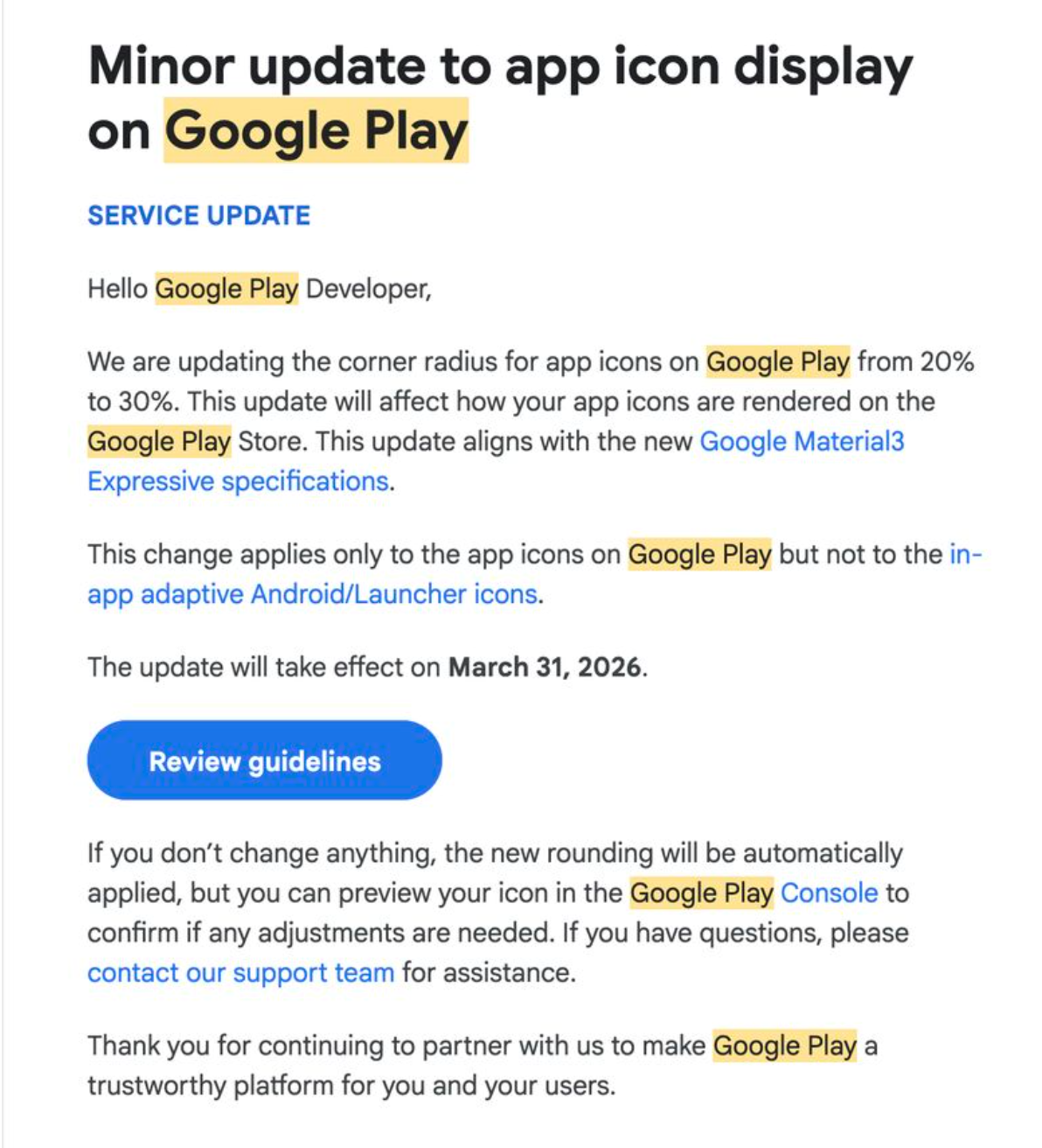
Why This Update Matters (Real-World Context)
If you ship Android apps at scale, your Play Store icon is not just branding — it directly impacts install conversion, trust, and review perception.
Google has quietly updated the Play Store app icon rendering rules, aligning them with Material 3 Expressive design standards. The change looks small on paper, but many existing icons will visually break if not reviewed.
Deadline: March 31, 2026
After this date, Google Play will auto-render icons with new rounding, regardless of how your source asset looks.
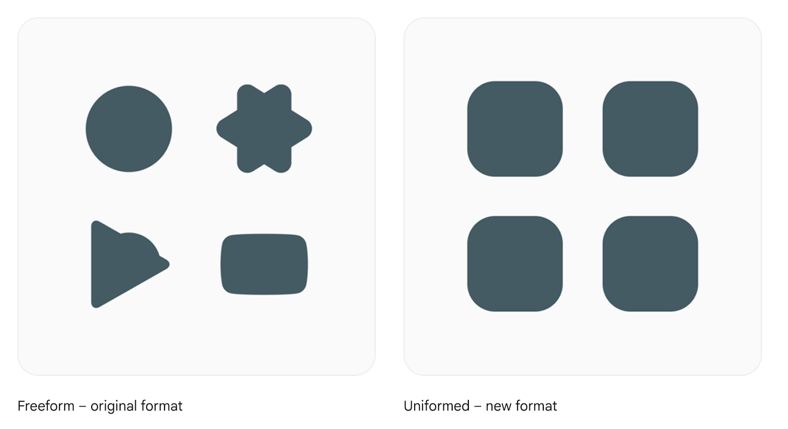
Old Behavior
Icon corner radius: 20%
Most teams designed icons tightly, placing:
- Text near edges
- Logos touching corners
- Badges aligned to boundaries
New Behavior
- Icon corner radius: 30%
- Applied only in Play Store listing
- Icons are now more circular
- Edge content may get cropped or visually cramped
⚠️ Important: This does NOT affect launcher icons or in-app adaptive icons. Only the Play Store listing preview is impacted.
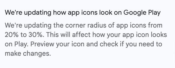
Earlier, Play Store icons used a 20% corner radius, so most apps designed icons tightly—placing text, logos, and badges close to the edges.
Now, the Play Store listing uses a 30% corner radius, making icons appear more circular. As a result, content near the edges may look cramped or slightly cropped in the store preview.
Scope Clarification (Avoid Common Confusion)
This change affects only one surface:
This means:
- Your APK / AAB does not need rebuilding
- No runtime changes
- No Android version dependency
It’s a design asset compliance issue, not a code issue.
Why Google Is Doing This
From Google’s perspective, Material 3 Expressive emphasizes softer, more rounded shapes. Using a consistent corner radius improves visual harmony, supports brand neutrality, and enhances accessibility perception.
Since the Play Store UI already uses larger corner radii across its interface, Google applies this change only at render time—masking icons dynamically—instead of forcing developers to upload new icon formats.
What Can Go Wrong If You Ignore This (Short & Clear)
From production audits, these are the most common issues:
- Text Gets Clipped: App names, abbreviations, or small taglines placed near the edges can be partially cut off.
- Logos Feel “Zoomed In”: Circular or edge-touching logos may appear overly enlarged because inner padding is already minimal.
- Brand Looks Inconsistent: The Play Store icon may look different from the launcher icon, and users often perceive this mismatch as poor app quality.
Step-by-Step: How to Fix Your Icon Safely
Step 1: Open the Official Specs and review Guideline
Refer only to Google’s official documentation: Google Play Icon Design Specifications
Step 2: Increase Safe Padding
From experience, aim for:
- ~15–18% internal padding
- Keep critical content inside a visual circle
Step 3: Avoid Edge-Aligned Elements
Do not place the following too close to the edges or corners: Text, Logos, BadgesKeep these elements well inside the safe area so they aren’t clipped or visually cramped by the increased corner radius in the Play Store listing.
Step 4: Test with Rounded Masks
Before uploading your icon:
- Apply a 30% corner radius mask
- Preview the icon at small sizes (48px–72px)
This helps catch clipped text, cramped logos, or balance issues early—exactly how users will see it in the Play Store listing.


