


.svg)

Introduction
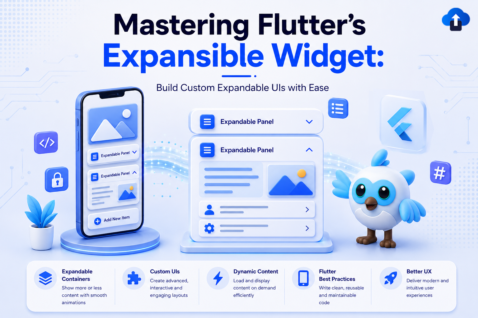
Flutter 3.32 (released May 2025) brought an exciting new addition to the widget toolkit: the Expansible widget. This foundational widget fundamentally changes how developers approach expandable UI patterns by separating expansion behavior from Material Design-specific implementations.
If you’ve ever struggled with limited customization in ExpansionTile or found yourself rebuilding expansion logic from scratch, the Expansible widget is here to simplify your workflow. Whether you’re building a custom FAQ section, an accordion menu, or a specialized collapsible panel, Expansible provides the core functionality you need with complete design freedom.
Problem Statement: The Limitations of Material-Specific Expansion
The Challenge
Traditional expandable widgets in Flutter come bundled with Material Design assumptions:
- Limited Customization - ExpansionTile locks you into specific spacing, colors, and layout patterns.
- Tight Coupling - Expansion logic is intertwined with visual presentation.
- Repetitive Code - Building non-Material expandable experiences requires reimplementing state management and animation logic.
- Design Constraints - Custom design systems often struggle to work within Material’s rigid structure.
Developers often faced these options:
- Force-fit ExpansionTile into designs that don’t match Material.
- Build custom expansion logic from scratch (time-consuming and error-prone).
- Use third-party packages (adding unnecessary dependencies).
Real-World Scenario
Imagine building a custom design system with: - Expandable cards with unique borders and shadows - Smooth custom animations (different from Material’s default) - Brand-specific colors and typography - A specific interaction pattern for your user base
With pre-3.32 Flutter, this meant writing substantial custom code for state management, animation controllers, and layout logic.
Solution: The Expansible Widget
What is Expansible?
The Expansible widget is a low-level, behavior-focused widget that handles:
- Expansion state management
- Built-in smooth animations
- Complete visual customization
- Separation of concerns (behavior vs. appearance)
Unlike ExpansionTile, Expansible doesn’t dictate how your expandable content should look.it just manages the expansion behavior, letting you design the UI exactly as you want.
Key Features
Implementation Guide
Technical Specifications
Basic Setup (Minimum Requirements)
Before you start, ensure you have Flutter 3.32 or later:
flutter --version # Should show 3.32.0 or higher
Expansible Example
void main() => runApp(const ExpansibleDemoApp());
class ExpansibleDemoApp extends StatelessWidget {
 const ExpansibleDemoApp({super.key});
 @override
 Widget build(BuildContext context) => MaterialApp(
       debugShowCheckedModeBanner: false,
       theme: ThemeData(
         colorScheme: ColorScheme.fromSeed(seedColor: Colors.deepPurple),
         useMaterial3: true,
       ),
       home: const ExpansibleDemoPage(),
     );
}


class ExpansibleDemoPage extends StatefulWidget {
 const ExpansibleDemoPage({super.key});
 @override
 State<ExpansibleDemoPage> createState() => _ExpansibleDemoPageState();
}


class _ExpansibleDemoPageState extends State<ExpansibleDemoPage> {
 final _controller = ExpansibleController();


 @override
 void dispose() {
   _controller.dispose();
   super.dispose();
 }


 @override
 Widget build(BuildContext context) {
   final cs = Theme.of(context).colorScheme;


   return Scaffold(
     appBar: AppBar(
       title: const Text('Expansible Widget Demo'),
       centerTitle: true,
       backgroundColor: cs.inversePrimary,
     ),
     body: Padding(
       padding: const EdgeInsets.all(24),
       child: Column(
         children: [
           // ── Programmatic control


           ListenableBuilder(
             listenable: _controller,
             builder: (context, _) => SegmentedButton<bool>(
               segments: const [
                 ButtonSegment(
                     value: false,
                     label: Text('Collapse'),
                     icon: Icon(Icons.compress_rounded)),
                 ButtonSegment(
                     value: true,
                     label: Text('Expand'),
                     icon: Icon(Icons.expand_rounded)),
               ],
               selected: {_controller.isExpanded},
               onSelectionChanged: (s) =>
                   s.first ? _controller.expand() : _controller.collapse(),
             ),
           ),


           const SizedBox(height: 32),


           // ── Expansible widget


           Expansible(
             controller: _controller,
             duration: const Duration(milliseconds: 350),
             curve: Curves.easeInOut,


             // Custom outer shell — animated drop shadow
             expansibleBuilder: (context, header, body, animation) =>
                 Container(
               decoration: BoxDecoration(
                 borderRadius: BorderRadius.circular(16),
                 boxShadow: [
                   BoxShadow(
                     color:
                         cs.primary.withValues(alpha: animation.value * 0.3),
                     blurRadius: 20 * animation.value,
                     offset: Offset(0, 6 * animation.value),
                   ),
                 ],
               ),
               child: ClipRRect(
                 borderRadius: BorderRadius.circular(16),
                 child: Column(
                     mainAxisSize: MainAxisSize.min, children: [header, body]),
               ),
             ),


             // Header — colour & chevron animate with expansion
             headerBuilder: (context, animation) {
               final bg =
                   ColorTween(begin: cs.primaryContainer, end: cs.primary)
                       .evaluate(animation)!;
               final fg =
                   ColorTween(begin: cs.onPrimaryContainer, end: cs.onPrimary)
                       .evaluate(animation)!;
               return GestureDetector(
                 behavior: HitTestBehavior.opaque,
                 onTap: () => _controller.isExpanded
                     ? _controller.collapse()
                     : _controller.expand(),
                 child: Container(
                   color: bg,
                   padding: const EdgeInsets.symmetric(
                       horizontal: 20, vertical: 18),
                   child: Row(
                     children: [
                       Icon(Icons.widgets_rounded, color: fg, size: 24),
                       const SizedBox(width: 12),
                       Expanded(
                           child: Text('Flutter Expansible Widget',
                               style: TextStyle(
                                   color: fg,
                                   fontWeight: FontWeight.w600,
                                   fontSize: 16))),
                       RotationTransition(
                         turns: animation
                             .drive(Tween<double>(begin: 0, end: 0.5)),
                         child: Icon(Icons.keyboard_arrow_down_rounded,
                             color: fg, size: 26),
                       ),
                     ],
                   ),
                 ),
               );
             },


             // Body — fades in after height is 40 % open
             bodyBuilder: (context, animation) => FadeTransition(
               opacity: animation
                   .drive(CurveTween(curve: const Interval(0.4, 1.0))),
               child: Container(
                 color: cs.primaryContainer.withValues(alpha: 0.25),
                 padding: const EdgeInsets.all(20),
                 child: Column(
                   crossAxisAlignment: CrossAxisAlignment.start,
                   children: [
                     _row(cs, Icons.tune_rounded, 'Full Visual Control',
                         'Build any header & body — no Material constraints.'),
                     _row(cs, Icons.animation_rounded, 'Animation Access',
                         'Drive transitions via the animation parameter.'),
                     _row(
                         cs,
                         Icons.settings_remote_rounded,
                         'Programmatic Control',
                         'Expand / collapse anywhere via ExpansibleController.'),
                     _row(
                         cs,
                         Icons.straighten_rounded,
                         'Custom Timing & Curve',
                         'Set any duration, Curve, or reverseCurve.'),
                   ],
                 ),
               ),
             ),
           ),
         ],
       ),
     ),
   );
 }


 Widget _row(ColorScheme cs, IconData icon, String title, String sub) =>
     Padding(
       padding: const EdgeInsets.only(bottom: 14),
       child: Row(
         crossAxisAlignment: CrossAxisAlignment.start,
         children: [
           Container(
             padding: const EdgeInsets.all(7),
             decoration: BoxDecoration(
                 color: cs.primary.withValues(alpha: 0.12),
                 borderRadius: BorderRadius.circular(8)),
             child: Icon(icon, color: cs.primary, size: 18),
           ),
           const SizedBox(width: 12),
           Expanded(
             child: Column(
               crossAxisAlignment: CrossAxisAlignment.start,
               children: [
                 Text(title,
                     style: const TextStyle(
                         fontWeight: FontWeight.w600, fontSize: 13)),
                 Text(sub,
                     style: TextStyle(
                         color: cs.onSurfaceVariant,
                         fontSize: 12,
                         height: 1.4)),
               ],
             ),
           ),
         ],
       ),
     );
}
Visual Result
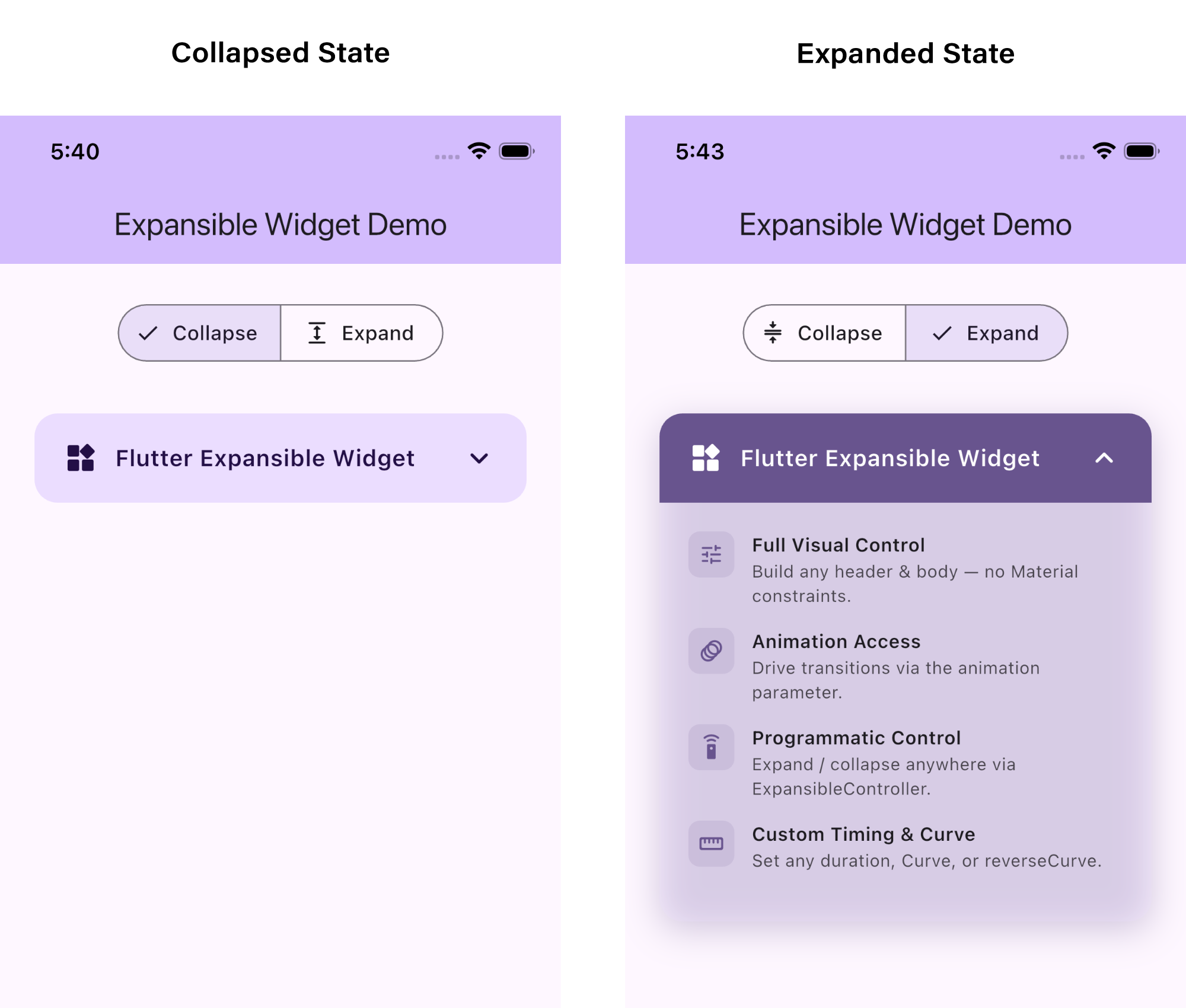
The rotating arrow indicator provides clear visual feedback, and the smooth height animation creates a polished user experience.
Key Takeaways
Why Expansible Matters
- Design Freedom: No more Material Design constraints build exactly what you need
- Code Reusability: Use Expansible across different design systems
- Performance: Lightweight widget with efficient animations
- Developer Experience: Clean API focused on separation of concerns
- Future-Proof: Base for building advanced expandable components
Quick Comparison: Expansible vs. ExpansionTile
Best Practices
- Use State Management: Combine with Provider or Riverpod for complex apps
- Animate Icons: Rotate chevrons/arrows for better UX
- Single Expansion: Consider restricting to one open item at a time
- Semantic Content: Add meaningful labels for accessibility
- Performance: Lazy-load heavy content in expanded body
Practical Tips for Implementation
Controller
Pass an Expansible Controller to expand or collapse the widget programmatically from anywhere a button, a parent widget, or even a different screen. Always call controller.dispose() in your state's dispose() to avoid memory leaks.
Duration
Controls how long the expand/collapse animation takes. A value between 200ms and 400ms feels natural. The same duration applies to all builders, so everything stays in sync automatically.
Curve
Applies easing to the animation. Curves.easeInOut gives a smooth symmetric feel. If you want different easing on expand vs collapse, set the optional reverseCurve property as well.
ExpansibleBuilder
Receives the built header, body, and a live animation. Use it to wrap both in a custom shell with rounded corners, animated shadows, borders. Since it runs inside an Animated Builder, you can use animation.value directly to scale any decoration property per frame.
HeaderBuilder
Always visible. The animation parameter goes from 0.0 (fully collapsed) to 1.0 (fully expanded). Feed it into ColorTween, RotationTransition, or any transition widget to keep your header visuals perfectly in sync with the expansion.
BodyBuilder
Hidden when collapsed; its height animates from 0 to full. Use the animation parameter to add a secondary effect, for example, a FadeTransition with Interval(0.4, 1.0) so content only appears after the panel is 40% open, avoiding a cramped flash at the start.
Conclusion
The Expansible widget represents a paradigm shift in how Flutter developers approach expandable UI components. By separating expansion behavior from visual presentation, it empowers you to create custom, beautiful expandable experiences without reinventing the wheel.
Whether you’re building a simple FAQ section or a complex collapsible interface, Expansible provides the foundation you need with complete creative control.
Next Steps
- Update Flutter: Ensure you’re running Flutter 3.32 or later
- Experiment: Try the examples above in your projects
- Explore: Check the official Flutter documentation for advanced patterns
- Watch Tutorial: See the widget in action on YouTube
The future of expandable UI in Flutter starts here. Start building amazing experiences today!
Reference Links
- Official Documentation Flutter Expansible Class
- Flutter 3.32 Expansible Widget Video Tutorial
- Flutter Repository


